MY DESIGN PROJECTS
Welcome to my design projects page! Here, you will see my projects I did in the classes I took at Arkansas State University. The first six projects you will see are projects I have done in 2021. Then you will see the seven projects I did back in 2022 . Finally the rest of the projects I did in 2023. You will also see two cool projects I did for my internship job for The Best Times company in 2022. By looking at each project, you will see my growth between them. I learned so much while creating and designing these projects that I can't wait to put the knowledge to the test towards my career job. I'm very proud of every project I have done, and I'm glad to showcase what I have done. There are still more projects I will be creating now and in the future, and I will be uploading them here on my portfolio website.
Please reach out to me on my "About Me" page if you have any questions about any specific project, and I will be glad to answer your questions!
Please reach out to me on my "About Me" page if you have any questions about any specific project, and I will be glad to answer your questions!
PROJECTS FROM 2021
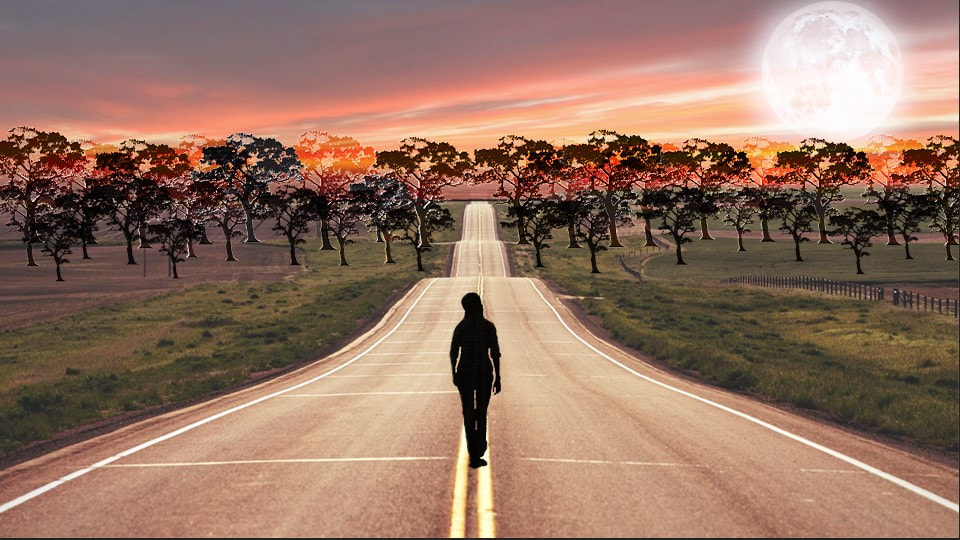
The Journey Road
Design Technology - Fall 2021
|
The Journey Road is a landscape collage project I did in Adobe Photoshop. The meaning of this college is "Chase Your Dreams but Always Know Your Way Home." When people see this collage, I want people to think about life and the dreams they have, but always know the way back home. Home is the most comfortable place for anyone to be safe.
|
|
Self Portrait Project
| |||
| Video Game Tournament Flyer.pdf |
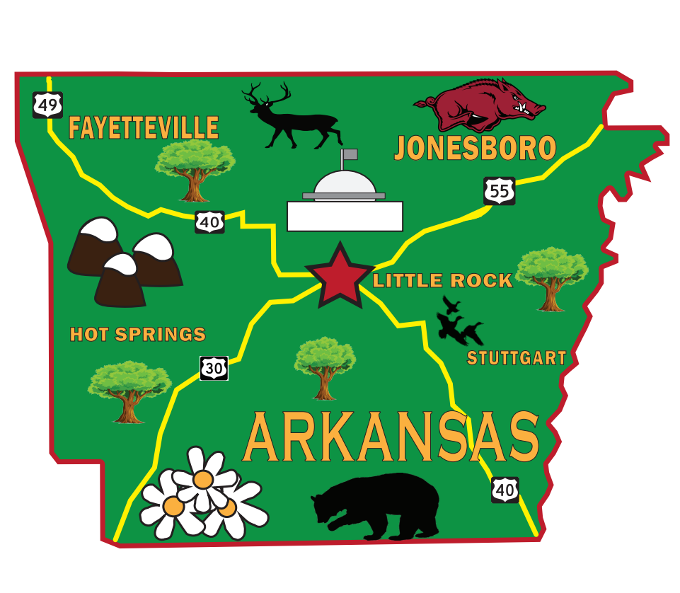
My Home Project
Design Technology - Fall 2021
|
My Home is a project I did in Adobe Illustrator. This is the state where I am from, born and raised in. I even included the county I was actually born and raised in and am still living in and some places I’ve been before. I also included the county where the university I’m attending is located, and that is A-State in Jonesboro.
|
|
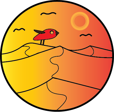
Find Your Destination
Design Technology - Fall 2021
|
The Find Your Destination project is a travel logo for a fictitious company called Amble Publishing Company, which is not a real company. I made this project using Adobe Illustrator. Since this company designs travel books and needs a logo for it, I decided to create a sunset logo with mountains, birds, and, of course, a sun. I named this logo "Find Your Destination'' I felt like that was a good title to represent this logo. When people see this logo, I want them to feel relaxed and think about a nice relaxing place.
|
|
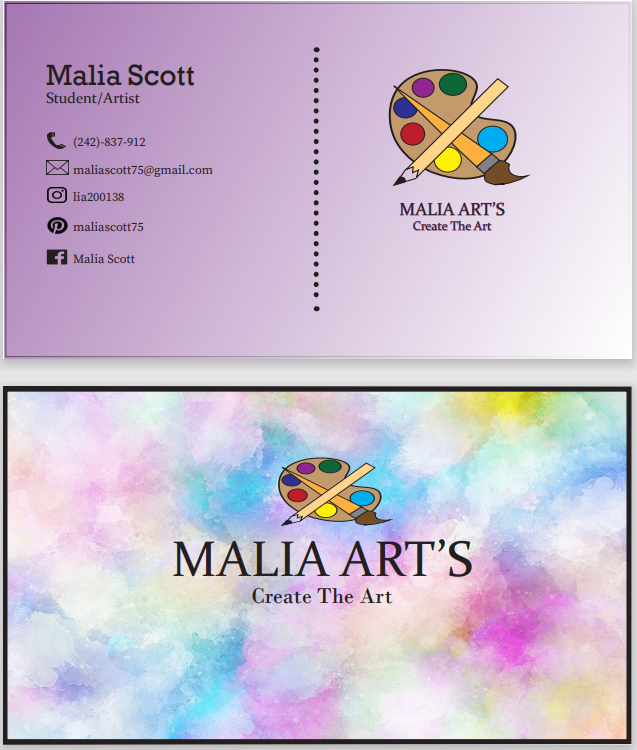
Business Card
Design Technology - Fall 2021
|
Malia Art’s Business Card is a project I made in Adobe InDesign. The business card design I made is for my art brand. I have a passion for art and I like to call myself an artist, but not only am I an artist, I’m also a college student. So, those two things represent my profession. The title of my card is "Malia Art’s" with the slogan "Create The Art". I really like the title and slogan I came up with. I feel like it really represents me, and plus, if one day I decide to run a real business, I will definitely use this title and slogan and card.
|
|
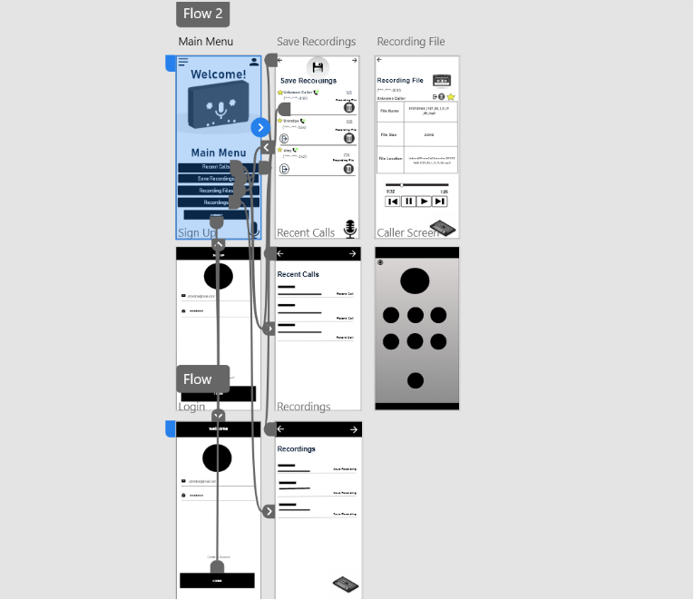
Phone Recorder App
Human Centered Design - Fall 2021
|
This is my wire flow of my Phone Recorder App, which is not a real app I created in the Human Centered Design summer course I took in 2021. The program I used to create this app is called Adobe XD. This app is a phone recorder for your phone. If you ever get a call like a scam or prank call, etc., you can use this app and it will automatically record the call. In the image, you can see there are grey wires that are attached to certain screens. The wires are how you are going to navigate through the app. Basically, it controls how the app will run.
Be sure to check out the link below to access my app! Make sure you highlight and copy the link down below into a new tab to see the app. https://xd.adobe.com/view/898966e9-0927-4d21-b9dd-fbec5a04cc8a-dcda/screen/6fa491a0-4579-4dab-9308-b78d6df37d15?fullscreen&hints=off For the "Solution Sketch" and "Crazy Eights" files showcase sketches I drew to get the idea of my app.
|
| ||||
PROJECTS FRROM SPRING 2022
Post Card Project
Desktop Publishing and Publication Design - Spring 2022
|
For this project, I decided to design a birthday postcard for my grandma because making birthday cards is fun, easy, and simple, but you can be creative with your design, which I like. This project was created in Adobe InDesign.
|

| ||
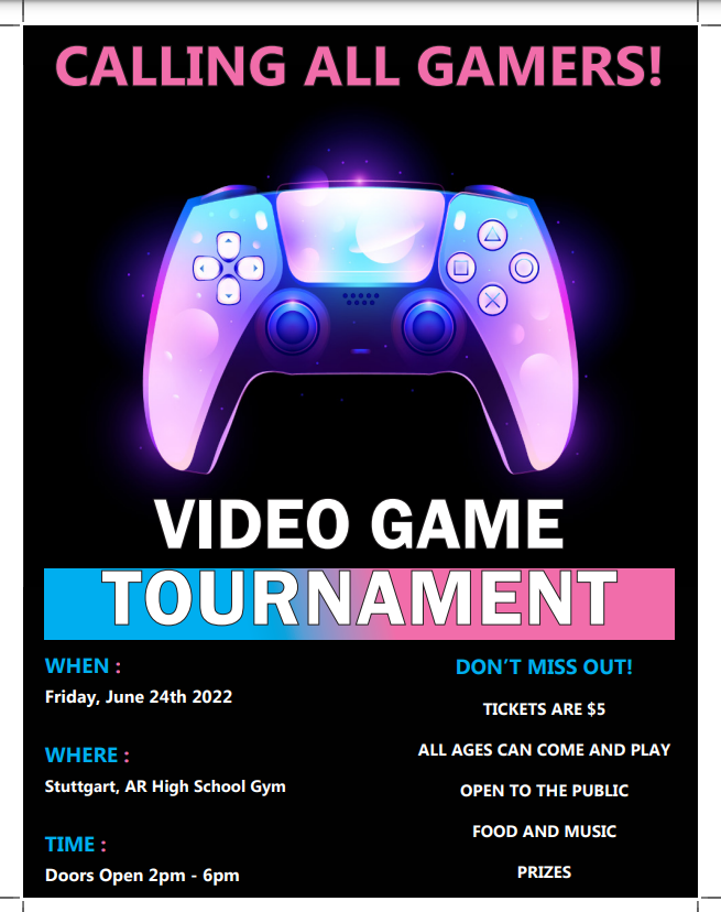
Flyer Project
Desktop Publishing and Publication Design - Spring 2022
|
The reason why I chose to make this design is because I find gaming tournaments very entertaining, loud, and colorful. I’m a gamer myself, and I'd like to attend one someday. When someone or a group of people hosts a gaming tournament, they have to promote it by making flyers, and I was inspired by those flyers. So, I thought of making one of my own if I was to host a video game tournament. To make this flyer, I used Adobe InDesign.
|
| ||
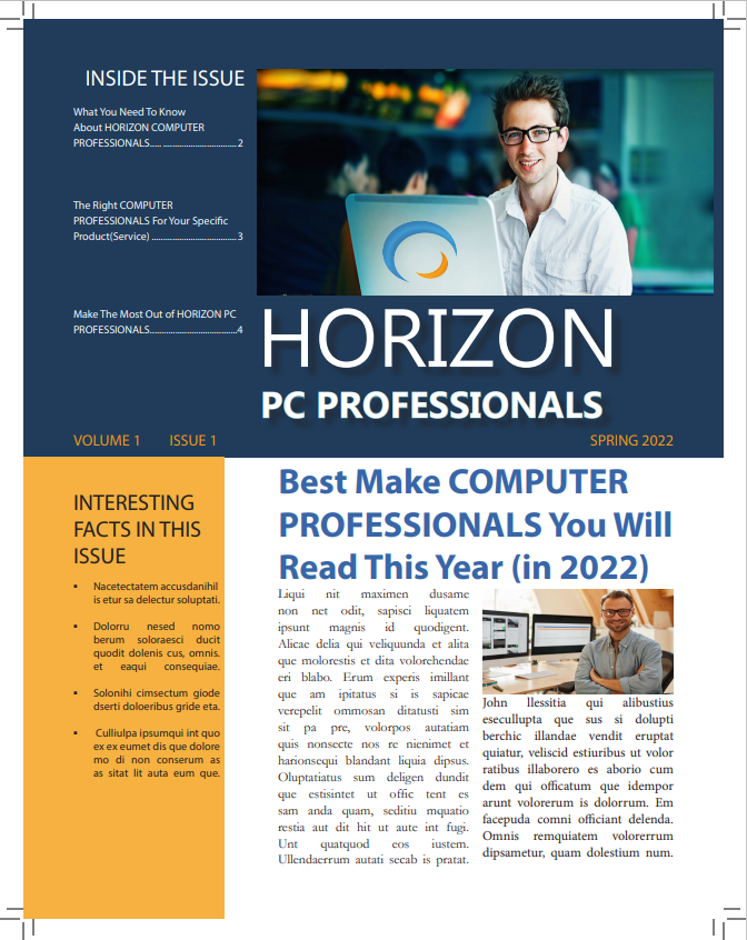
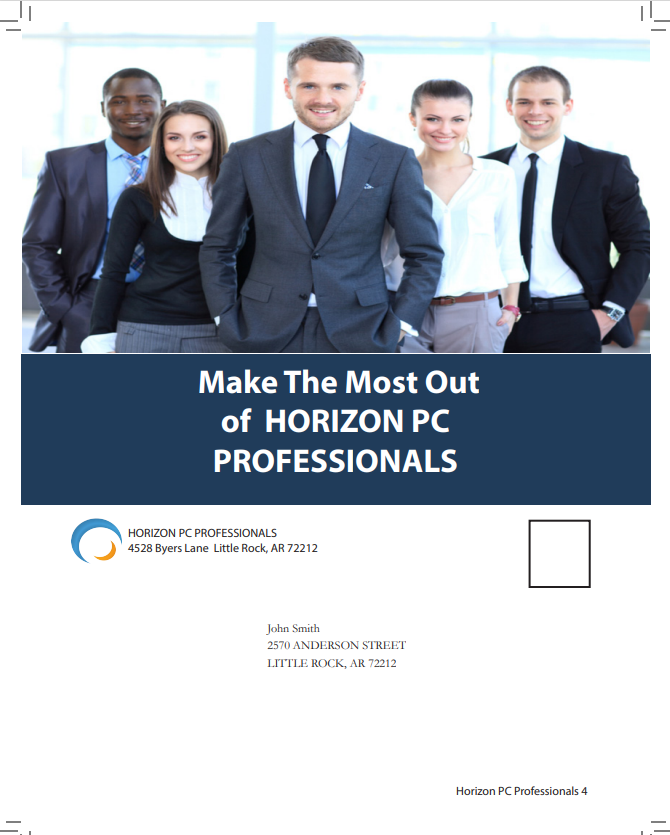
Identity Package Project
Desktop Publishing and Publication Design - Spring 2022
|
For this project, we had to come up with a fictitious company and make it look like a real company. That's where we used Adobe InDesign. We made an identity package with a logo, business card, letterhead, and envelope to represent our company. I chose this company and design because of the name I came up with. Horizon PC Professionals does sound like a world-wide tech company that knows a lot of PC components and systems. I can see this company being real and reliable for people to look into. So, the next two projects you are about to see are related to my company.
|
Logo
Envelope
Letter Head
Front of Business Card
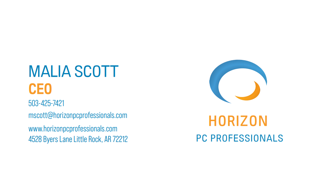
Back of Business Card
| ||||||||||
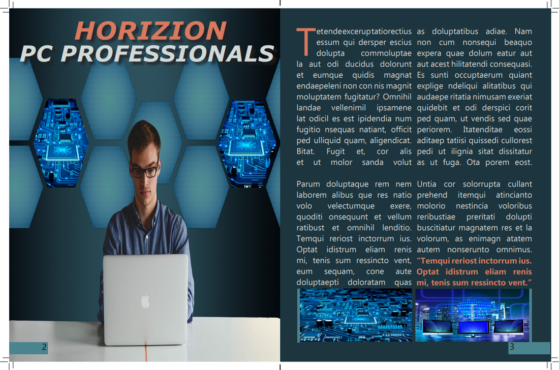
Magazine Spread Project
Desktop Publishing and Publication Design - Spring 2022
|
For this project, I thought about what if my company was advertised by a magazine company in their magazine using their color scheme and layout, so that's what I went with. This project was created in Adobe InDesign as well.
|
| ||
Newsletter Project
Desktop Publishing and Publication Design - Spring 2022
|
For my newsletter design, I was inspired by different newsletters I saw online. So, I created my own layout to make my newsletter look professional, creative, and interesting. Also, along with natural color schemes for my business, I also want this newsletter design to make people take an interest in the company. This project was created in Adobe InDesign.
|
| ||||||||
PROJECTS FROM MY INTERNSHIP JOB (2022)
Expo Logo Design
Internship project - Spring 2022
|
The expo logo design project is my first project I did for my internship work. All I had to do was come up with some logo designs for community expo events in the Memphis community. I used my iPad to create the logo with an app called Adobe Express.
For these logos, I focused on branding, hierarchy, creativity, and the design principles. As I was designing, the one thing I kept in mind is that logos are meant to be placed on certain designs and are used to represent things. So, I focused on the design and layout. I tried to use the same font as the company brand name and the color scheme of the company. I used a circle to place the text in as well as created space to add the community names. I feel like using a circle for the logo designs will be appropriate because they are clean, simple, and recognizable. They always bring an aesthetic appeal. Overall, I like the logo designs, and the company liked them as well. As of today, they are using the logos in the resource guides and websites.
By clicking on "My Logos in Magazines" is where you will see some images from magazines on how The Best Times use my logos for their company.
|


| ||
Resource Guide Covers
Internship Project - Spring 2022
|
For this project, I had to design resource guide covers for my internship company, The Best Times. They wanted me to design some covers where the idea is featured as "Take the Puzzlement out of Finding Resources". So, I added icons to represent the topics the resource guide represents. For these designs, I used my iPad and the same app called Adobe Express, using the tools within the app.
Overall, I like these cover designs. In this project, I concentrate on my design skills, such as primary design skills, creativity, and branding. I tried to focus on the smallest details and work my way around the covers. Also, there was a fact I liked in Margaret Gould Stewart’s TED Talk video where she said, "If you want to design for the whole world, you have to design where people are, not where you are." I kept this in mind when designing the covers, especially my resource guide covers, since it was a task I did for my internship and I wanted to design covers that fit where they are with their covers. Doing this internship gave me the experience in a professional setting and outside of my game design skills. It gave me the chance to work on my other design skills I have learned from design courses. Moreover, I got to practice professional communication and collaboration and how they influenced the final products.
For the January 2022 Resource Guide, I helped created the cover. The idea for the cover was to use a rubix cube for the cover. The idea is featured around "Take the puzzlement out of finding resources".
|
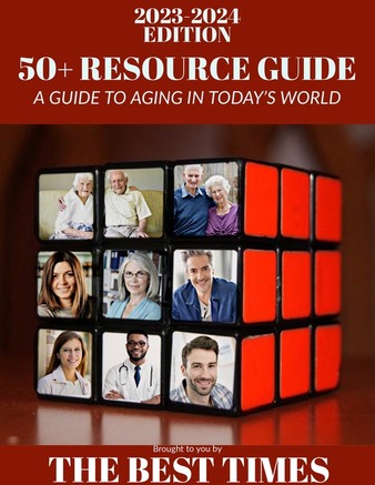
For my Resource Guide Covers project, I made two covers using a rubix as the cover and two of the other covers. These resource guide covers were for my internship project. Starting with the dark red/maroon cover, I used a rubix cube and made it bigger to fit on the page. They wanted me to design some covers using a rubix cube. Next, I added two colored rectangles on the top and one at the bottom to bring out the cover. The last thing I added was text and font style. The same goes for the layout.

The next cover is the dark blue and yellow cover. I used the same layout as the dark red/maroon cover, but using a different rubix cube and pictures. I wanted each cover to have different pictures along with icons on the cover so each cover could stand out.

Now, as for the last two covers (Above one and the bottom one), they differ from the other two covers. I felt like each cover didn’t have to be a rubix cover. It could be a normal cover. So, for those two covers, I used different pictures mixed with some of the same pictures. I place the pictures off to the side on both covers so I can have room for the text. One cover has a background picture, while the other has a colored background. As for the text, both text layouts are different and have different fonts.

| ||
PROJECTS FROM 2023
PATTERN PROJECT
Digital Illustration - Spring 2023
|
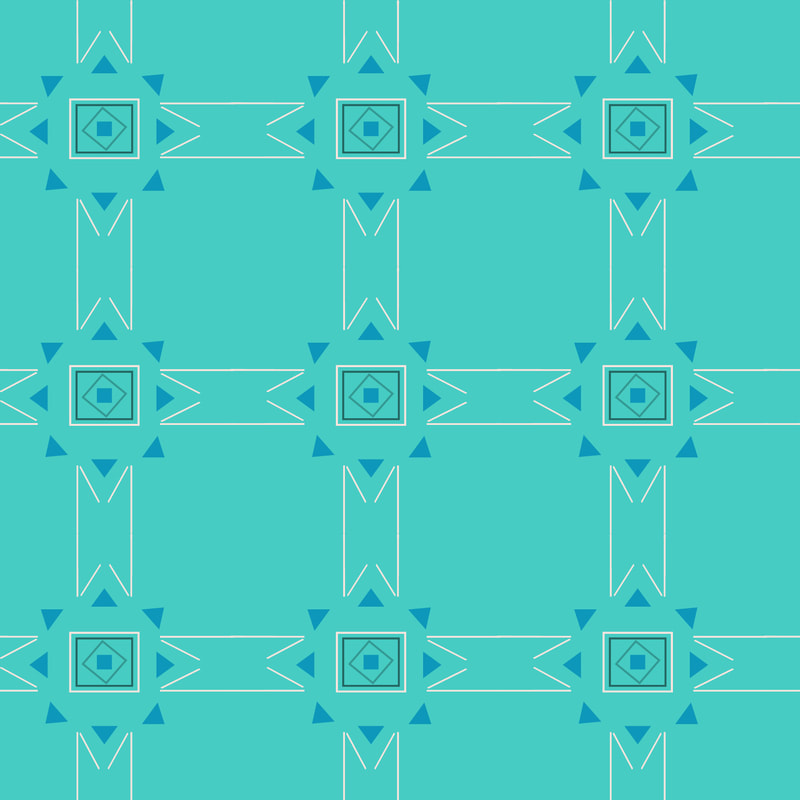
For this project we used Adobe Illustrator to create a seamless pattern using one or more letters from our initials and using colors that represent who we are. I wanted my pattern to be geometric and creative with shapes and colors to represent me. Starting with the letter M, I use the line segment tool to manually make the letter M. I thought it would be cool to make a letter instead of using a font. Moving on to the colors, I wanted them to not be too bright and be more calming and a little dark since I’m a little quiet and shy. The colors I have are turquoise, light pink, teal, and blue-green. I made the background a turquoise color, which is my favorite color, but there are a lot of different meanings behind this color, and the two meanings that I believe represent me are encouraging creativity and the expression of hopes and dreams. So, I thought about making my favorite color the main color of the background. For the color of the letter M’s, I made them a light pink color because I found out pink can represent shyness, which in this case I am a shy person, and I like how this color stands out within the letters and background. Turquoise and pink are a bold combination. For the shapes, I added some triangles around and between the M’s to fill in the gaps. I colored the triangles a blue-green color to add some dark color to the pattern. Same goes for the little square in the middle. I added three squares around the little square, leaving one square rotated to look like a diamond. Then I added a light pink color to the first square, a darker shade of teal color to the second square, and a light-dark shade of teal color to the third square. By adding these shapes, I use them to add a geometric element to my pattern. Also, if you look closely, you can see more shapes, like how the letter M’s almost look like a star or a throwing star, and how the triangles make the shape of a sun. Overall, I like my pattern, especially my creative letter M. This is different from other projects I have created.
|
|
OBJECT STYLIZATION PROJECT
Digital Illustration - Spring 2023
|
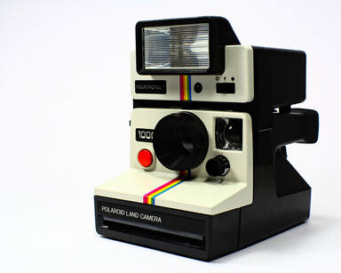
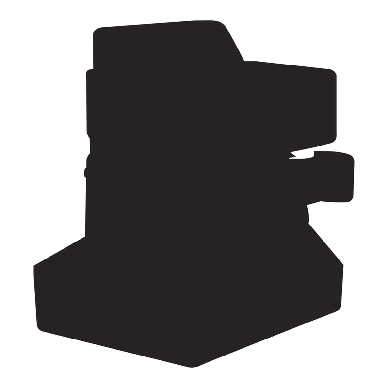
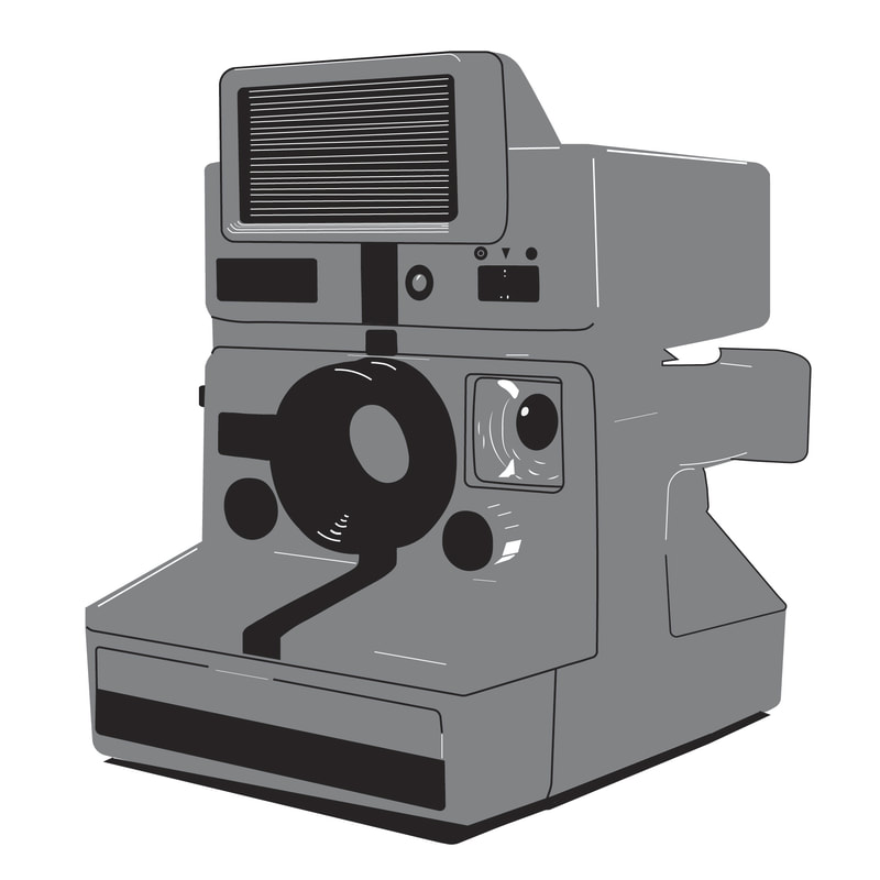
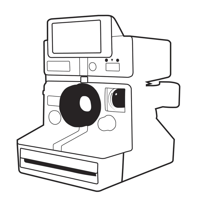
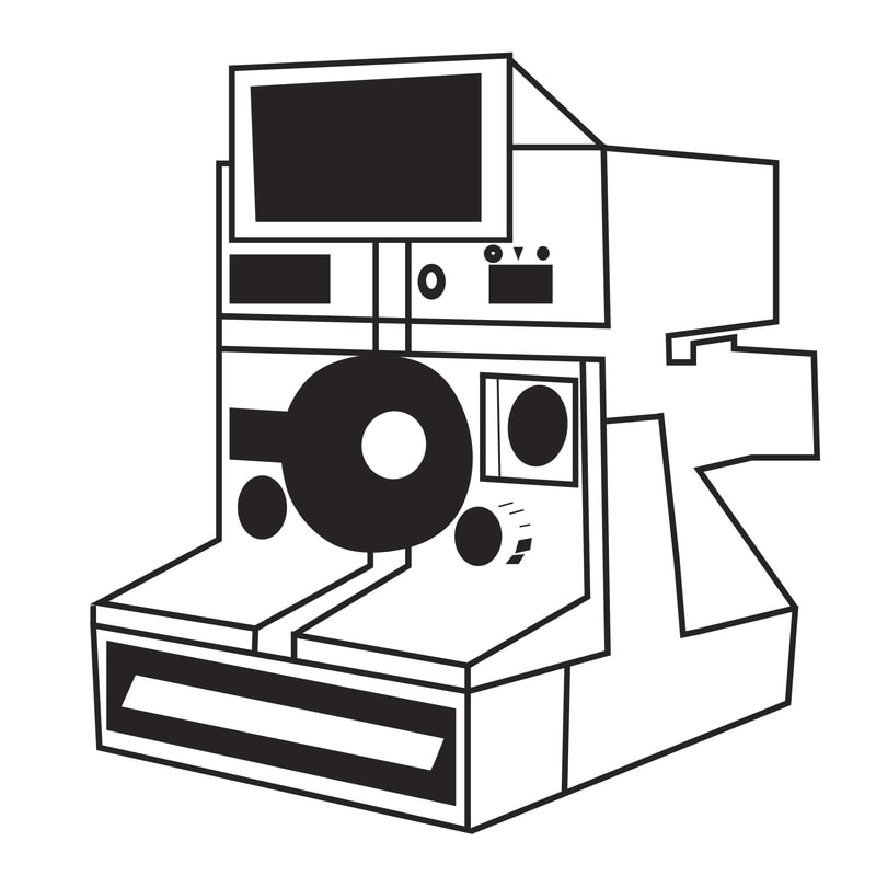
For this project we used Adobe Illustrator to create an illustration that celebrates an person and their invention. This is part 1 of this project. The object had to be something that is physically held and touched. For this object we had to stylize it as a silhouette, limited value, contour, and geometric. The item I did is an old polaroid camera. I enjoy looking at old vintage things like old films, cameras, etc. I own a polaroid camera and I like how pictures come out like an old school photo. For my stylizations, I did a silhouette, limited value, contour, and geometric. I did a silhouette because it was the easiest style to do first since the only thing you had to do was trace around the object and it wasn’t a problem for me. Also, the boldness gives off an interesting look and I think you tell that the object is some type of camera. The next style I did is limited value. I feel like this was the hardest style to do because I didn’t know how much detail I should add, so I added light and shadow to help settle the detail and the grey tone background. However, I feel like less detail could be better, but I’m not sure. The third stylization is contour. For the contour, I focus on the lines and dark areas that I felt important to the human eye. Starting in the middle is the ring of the camera, which is dark with shiny lenses in the center. Then off to the right is another camera lens, which is the viewfinders that are dark with a small shine on the lenses. The bottom is dark and also is the open hole of the camera where the photos come out of. Last, I added the dark color symbols on the camera near the top. For the lines, the trace outline is a little bigger since it's the highest priority. The inside lines, which are the thin strokes of the buttons and details in view lenses, are quiet and as for the bottom where the slot where the picture exits, the strokes lines are medium thick. At the top, the flash bar strokes lines are medium thick. The last stylization I did is geometric. This style was a little tricky since geometric focuses on shapes and straight lines. So, I try my best to make the camera look the same but geometric. It looks different from the rest due to adding more stroke lines and making the strokes thicker. However, my focus was to make the geometric shapes serve and showing what the item is supposed to be such as the details. Overall, I like each stylization I have done to this object and they have their own style but still represent the same object which is cool.
|
Polaroid Camera
Silhouette
Limited Value
Contour
Geometric
|
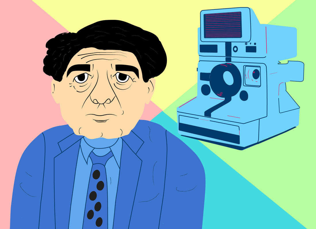
CHARACTER STYLIZATION PROJECT
Digital Illustration - Spring 2023
|
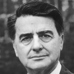
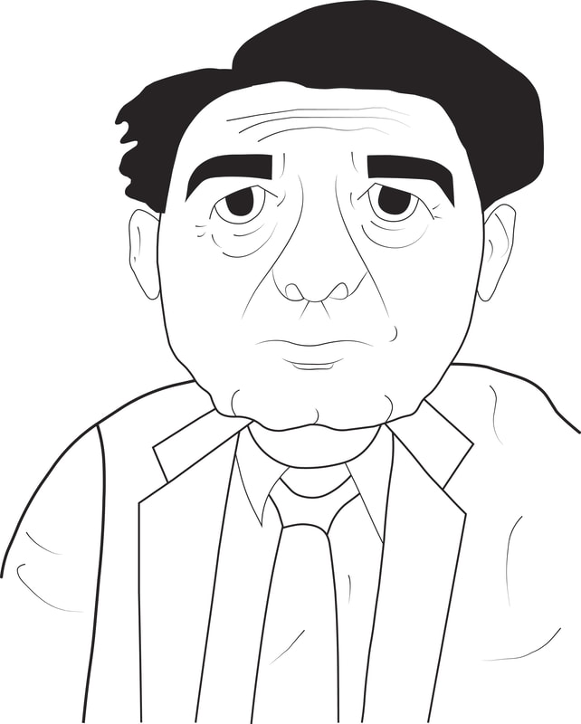
This is part 2 of part 1 project and we used Adobe Illustrator for this project as well. The person I have done is Edwin Herbert Land who was a Russian-American scientist and inventor and he was the inventor of the polaroid camera. The stylization I chose is cartoony. I’m not used to drawing characters in a cartoon style, so this was a new challenge to me, especially digitally. I spent hours looking at cartoons, especially old men cartoon characters to help with the inspiration. I notice cartoons have a lot of emphasis, shapes, and lines. So you kind of have to think of what someone would look like in cartoon style. I felt like that was the hard part of taking someone from real life and turning them into a cartoon character. The easiest part was the drawing. I started drawing on paper first before taking it to Illustrator. As I was drawing, I focused on straight and curved stroke lines. Since this is cartoony, I made Edwin's head round with a lumpy chin and curvy wrinkles on his face since he is an older gentleman. I wanted his head to be a little bigger than his body. I have seen cartoon characters where their heads are bigger than their bodies, which is a classical cartoon. I then made his ears, eyebrows, and eyes look cartoony, but they looked like his in real life. As for his hair, I wanted him to have the same style as in the original photo but look more cartoonish. On the left side of his hair represents the less amount of hair he had at the time and it wasn’t smooth like it was when he was younger. Lastly, for the body, his body is a little smaller than his head, and I wanted him to wear a suit since he wore a lot of suits. Along with the suite, I added curve strokes to look like wrinkles in the suite to bring out the details. Overall, I like this cartoony style, especially being my first time, and I know there are other things I could have done with this stylization.
|
|
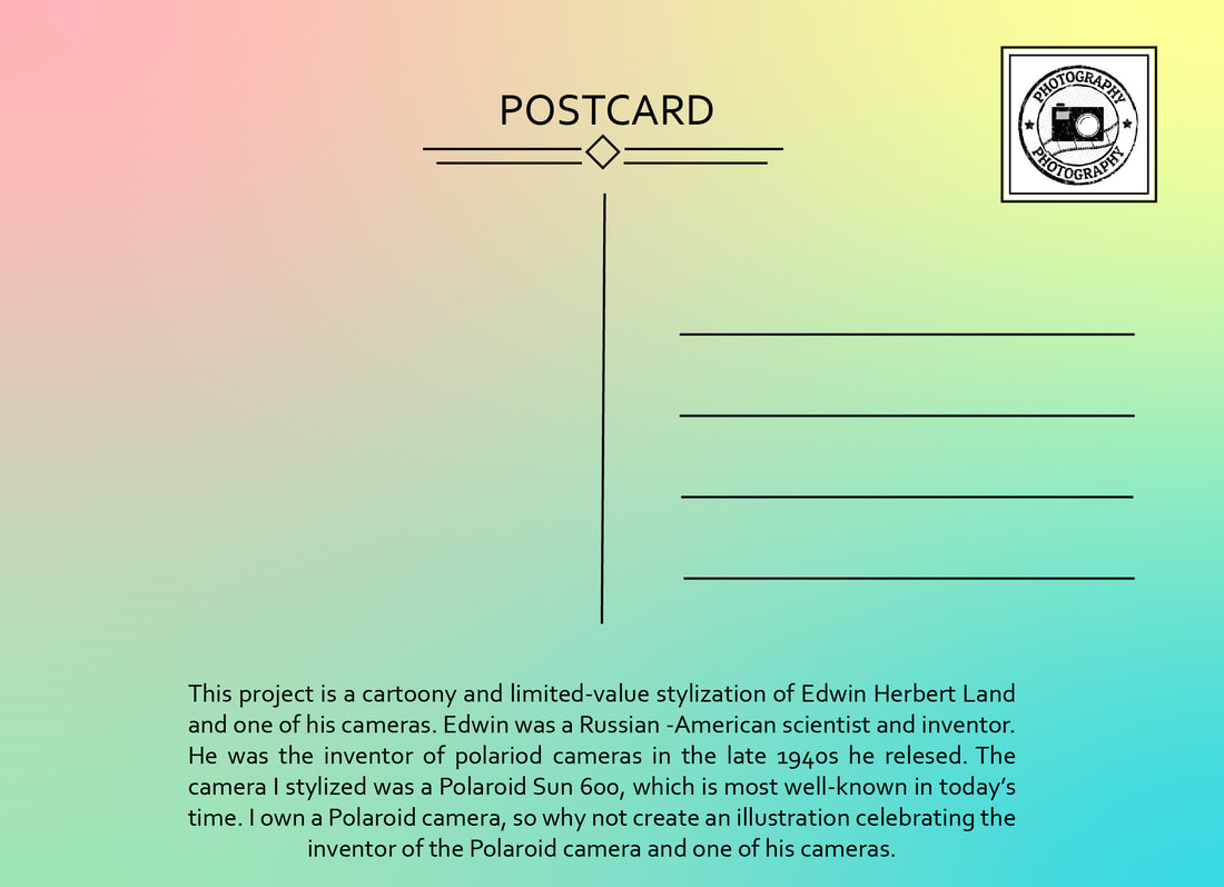
POSTCARD PROJECT
Digital Illustration - Spring 2023
|
This is part 3 of both part 1 and 2 projects and we used Adobe Illustrator for this project as well. Using our favorite stylization for the object and person, we assembly and add colors to create a postcard. The way I brought everything together, starting on the front with my object, the stylization is of limited value. I colored it using the monochromatic color scheme of the color blue with one accent color. The accent color is a ruby color, which represents the brightest values of the objects. I tried my best to remove some detail, but it was hard to find what should be removed and what detail should stay. Moving on to my person, Edwin Herbert Land, who is cartoony, I added texture to his hair, making it more hairy like real-life hair and more cartoon. Then I gave his face a real, natural skin color. For his suit, I color it using the monochromatic color scheme of the color blue, and then I add texture to create wrinkles in the suit. Lastly, I added round black circles on his tie to create a designer tie you would see in real life. For the background, I had a hard time trying to figure out what I should do for the background. I was going to add an image for the background, but I couldn’t find a good one, so I decided to go with a color pattern background. Since polaroid cameras are really old school, I made the background have some old school colors and I feel like my person and object stand out more. I made four triangles, and for the colors, I went with bright 90s old school colors to color the triangles. As for the assembly, I made my person be a little bigger than the object since he is the inventor, and next to him is what he invented, with the camera facing him looking a little small but not too big.
Moving to the back side of the postcard, I wanted the back to be a simple design. I put the word postcard in caps with a san serif font across the top like most postcards does with a little design underneath. Over to the right is the stamp. I tried to find an old-school camera stamp of a polaroid camera but couldn’t find one; however, I found this one, and I think it looks good to represent the stamp. On the left side is my short paragraph about the project, written in a sans serif font. Lastly, for the background, I went with a white background like most postcards have. Overall, I think my postcard turned out well. The only concern I had was finding a good background for the front of the postcard; however, it still looks good. |
Front side
Back side
|
PIXEL VEGETABLE PROJECT
Digital Illustration - Spring 2023
|
For this project we had to stylize a chosen fruit or vegetable in pixel art. We use a software called Piskel App. For my pixel art, I chose to do a beetroot, which is a vegetable. The way the process went for me is that this was the first time to ever create pixel art and I was very nervous on how I was going to do this, but thanks to one of the lesson videos, it really helped me a lot. I first sketch and modify the following reference image of the beetroot using the pen tool. That was the easiest part for me. The hardest part was the refinement of my sketch, especially the corners and lines. I tried my best for the body of the beet to make the corners have a smooth nice flow and look round. So, I kept in mind that pixel circles need to have even steps. There was a lot of adding and erasing and there was a lot of counting involved in the body of my beet. As for the roots and leaves there were a lot of adding and erasing, but didn’t focus on counting, but didn’t focus on counting, but focus on the shape form of the leaves and roots from the reference image. The coloring was also easy and the shading was a little tricky, but following along with the lesson video, I got an idea of how coloring and shading should be. It took me a few times to find the right colors and shades especially for this type of vegetable. For the shading, I tried to focus on where the lightning will be and how the shades will look. That's why there’s dark colors going around the body of the beet, stems, and leaves. Also, for the leaves they have dark spots on them so I made the spots a little dark to help with the detail as well as the shine spots on the beet. What I take away from this process is that from one of the lesson videos is that sometimes you go through and do something and it turns out that it's not right and that it's okay because it's part of pixel art. This is a good point to keep in mind when doing pixel art since when trying to create something, it's not always going to be exactly right or on point. It's part of the process. However, I don’t think I will do more pixel art since it takes a lot of talent but the more practice, the better you’ll be. I’m more interested in doing line art and doing 3d model design such as characters for a video game. Overall, I really like my pixel art. This is a very different type of art stylization I have ever done and I’m proud of myself for this being my first time and experience.
|
Reference Image
|
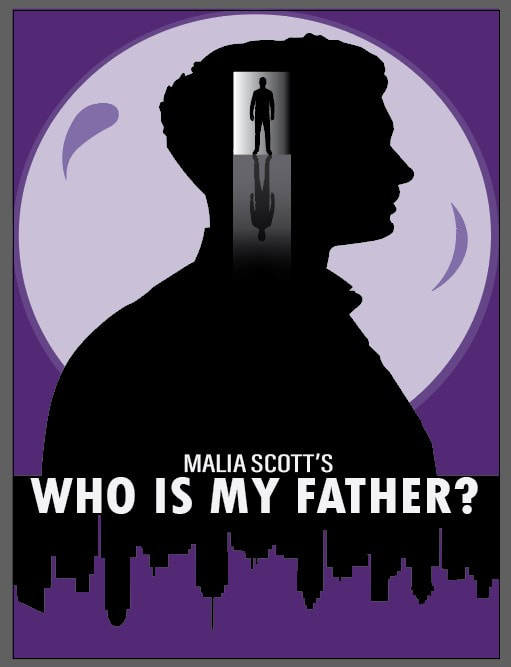
POSTER PROJECT
Digital Illustration - Spring 2023
|
For this project we had to create a poster for an existing or self-created IP in Adobe Illustrator. The poster had be any type of poster style such as a movie poster. The poster stylization I went with is a minimalist movie poster of what the book cover would look like for my fiction story "Who is My Father?" that I wrote in a class called Creative Writing. Starting with the background, I made it purple since purple represents mystery, which is the genre of my story. I added two different-sized circles with different shades of purple to help with the balance of the colors and make sure my design is not too overwhelming or too bright. Within the circles are two shape designs to help with the visual appeal of the cover. Moving on to the silhouettes, there’s a city, the son, and a man. The son is larger than the man. Inside his head is a doorway where the man is standing and where the son is thinking about who his father could be. The doorway has a light, and the son can see the light of finding his father. For the doorway, it has gradient colors of white, gray, and black. I tried my best to make it look realistic with the shadow of the man of shadows lighting a dark hallway. Lastly, down below is a silhouette of the city where the story takes place. Also, I made the city upside-down to create a dynamic feel of it. Finally, the title is bold in caps and is place within the city, which fits well there. Then above is my name in medium bold in caps to represent myself as the writer and author of this story.
Overall, I really like my poster design, and I’m very proud of how it turned out. I can’t stop looking at it because, to me, it's engaging. I think what went well about the final piece is the silhouettes and colors. They work well together and make everything look well designed, like a book cover you would see. I’m not sure what I think could be improved, but I think my doorway and hallway shadows could be improved. It takes a little bit of time to get the shadows to look right after tweaking a couple of times. |
|
CINEMAGRAPH PROJECT
Motion Graphics - Spring 2023
|
For my cinemagraph project, I intended to make a ball levitate, or float, in the air while going up and down. I found my ball on Pixabay. I had a few ideas of what I wanted to do, such as having a background of an open sky or fog where I will have a person standing with their hand open as the ball is moving without touching their hand like they have some type of superpower. However, I couldn’t find a background I liked to represent these ideas, so I had to change them around. Since there’s some type of light reflection on the ball, I thought the background should be a spotlight or lamp light of some sort reflecting on the ball. So I thought about a desk lamp background where the ball could float. I found this background called a Gray and Black Laptop on the Table by Anna Nekrashevich on the Pexels website, and I think it fits well with my ball image. Also, I like how the background and desk are white with little shadows of the objects, and I like how there's a small box on the desk where I instantly know where I want my ball to be.
Starting with the background, I added a sharpen effect to increase the contrast a little bit and make the image look crisp and clear. I was going to add a hue/saturation effect, but I think the colors and lightning in the image look fine. Next is my shiny ball. I added a luminosity blend mod and an outer glow layer style to add a little color to the border of the ball. However, I feel like it doesn’t need an outer glow, and I want to focus on the visual appeal. Lastly, there is the ground shadow. I added a subtract blend mode and a hue/saturation effect to make the shadow more visual. Then I added a drop shadow, inner shadows, and a stroke layer style. I thought it would be more appealing to add a ground shadow as the ball goes up and down. I set keyframes for the scale so that as the ball goes down, the shadow gets smaller and goes back to normal size as the ball goes back up to its original size. Overall, I like my cinemagraph project. Its a very different project I have ever done and its a project I could do again on my own time. The techniques I used were a boomerang motion and a time-reverse layer to create a nice, clean loop so it's constantly playing without any stops. I also use the easy ease key assistant on my keyframes to adjust the speed of the ball's motion.
|


| ||
KINETIC TYPOGRAPHY
Motion Graphics - Spring 2023
|
For my kinetic typography project, I did a movie trailer for the movie Batman Begins, which is one of my favorite Batman movies. I would say the mood of my piece is darkness and despair, as well as the mood of the movie itself, with Batman’s aesthetic being dark and gritty, and the movie taking place in Gotham City, which is affected by crime and corruption. It was hard to choose what font to represent the mood, so I did some research about what font represents Batman and found different fonts. Most of the fonts mentioned were not in Adobe, but I found that blocky fonts are used to represent Batman. So, the font I chose is Segoe UI Batman. This font has a mix of bold and light gray text, which I like. The bold text represents the male voices, and the light text represents the female voice. Sans-serif fonts are best for a dark mood and emphasize the text, especially bold text. However, I think the Segoe UI Variable font matches the mood of this piece, but I feel like I could have chosen a different font. As for the graphics, it was kind of hard to find graphics that matched the mood, so I went to the Pexels and Pixabay websites to find two images that matched the mood. The first image you see within the beginning represents darkness of a coldness with fog and little light coming through, which reminded me of the movie Bruce left Gotham since the failed attempt to take down his parents murder then became imprisoned in China, where he sat in a cell that was dark with little light, and it made Bruce have this darkness aroma around him as well as feeling despair of complete loss and hope within himself. The next image represents despair towards Rachel about how she felt about Bruce being gone for so long and hoping that he was okay, as well as despair towards Gotham City since it completely became lost and has this dark cloud over it with the crimes of criminals and corruption. I also added Batman logos at the start and end of the piece.
For the colors, I wanted dark colors like black and gray since Batman revolves around those colors. I made the text white so it's easy to read and made some key words black and dark red. The techniques I used first were creating dynamic movement between keyframes with the graph editor to create some dynamic movement with text as well as adding animations to my text. I tried to add the 3D text to video footage, but it came out a little different. I use a camera to make the camera fly through the text. However, I still think it came out cool. Lastly, I added some effects and shape layers to create some transitions to make my kinetic typography more appealing. Overall, I like my kinetic typography project; it's very different from any other project I have ever done. I know I probably could have added more, but I think it still turned out well. |


|
STREAMING PACKAGE PROJECT
Motion Graphics - Spring 2023
|
The brand of my piece is a futuristic gaming brand I made up and created called Lia Games, which represents me as a game designer that creates certain types of games. Also, the slogan of my brand is "Play Beyond," and in the gaming world, gamers are constantly playing games, making them play beyond all games. My brand has a positive attitude and a triumphant mood. My games within my brand are about making gamers be and stay positive during play, which makes them better, faster, and smarter. My games will also make gamers feel triumphant when they complete and win them. Since the style of my brand is futurist—a design in a modern, minimalist way. The logo is the initials LG, which contain a specific font. The colors are shades of gradient purple, like a purple galaxy, and a white color. The shapes I included were stars and lines to represent the galaxy and the future style.
The fonts I used were Noize, Stacker, and Debug, which are not in After Effects. I found and downloaded these fonts from somewhere else. These fonts match my brand because I feel like they represent gamers, the future, and digital. Stacker is my LG logo, Debug is Lia Games, and Noize is Play Beyond. The Noize font was also used in the looping animation. For the graphics, I wasn’t sure what to include besides adding shapes and a background. So, I ended up adding a START button graphic, an online gaming graphic, and a mouse cursor. The START button graphic represents the gaming theme of my brand. The mouse cursor, which I animated to come up and click the button as the button scales away like a game is about to start, I tried my best to be creative with it. For the star shapes, I put a few in the sky as they twinkle within the galaxy background. The lines that come racing through the screen represent lasers with a glow effect. They also showcase the gaming theme of my brand. The online gaming graphic that is rotating represents the Play Beyond slogan in a world full of gamers. That graphic showcases my whole brand as a game designer creating certain types of games. For the techniques, starting with the expressions, I use the loopOut("pingpong") expression for my loop animation, the "Stream Starting" text, and I use the inertial bounce expression for my start animation, the LG logo. The other techniques I use are key frames for each text and effects to easy ease, animated transforms, and loops, as well as using the graph editor to adjust the speed of some key frames. Overall, I think my streaming package turned out well. I tried to be creative with the whole project, adding in as many sound effects as possible. I know there are probably some things I could add or change, but I think it still looks good.
|


| ||
ANIMATED BACKGROUND Project
Broadcast Graphics - Spring 2023
|
This project was created using specific tools inside of Adobe Affects. Creating backgrounds is an important part of broadcasting. For this project, we created three different looping animated backgrounds.
Background one utilized the following layers/effects: 1 solid layer 1 adjustment layer Effects used: Turbulent Noise, Mosaic, Tint, Exposure Background two utilized the following layers/effects: 2 adjustment layers 2 solid layers Effect used: 4 - Color Gradient, CC Particle Systems 2, Mosaic, Curves, Exposure Background three utilized the following layers/effects: 2 solid layers Effects used: 4 - Color Gradient, CC Particle Systems 2 |
|
ANIMATED WIPE PROJECT
|
|
ANIMATED LOGO REVEAL PROJECT
|

|
ANIMATION LOWER THIRDS PROJECT
Motion Graphics - Spring 2023
|
This project was created using Adobe Affects. For this project, we created three different styles of lower thirds, where in a lot of broadcasts, people have to be identified when they come on screen. For me, I did my name and title that represents of what I do for a living.
Lower Third 1: 2 Solids Effects used: Fill Lower Third 2: 1 Shape layer Effects used: Motion blur, Drop Shadow Layer styles: Bevel and Emboss Lower Third 3: 5 Shape layers Layer Styles: Bevel and Emboss |
|
KINETIC TYPOGRAPGHY PROJECT
Broadcast Graphics - Spring 2023
|
Disclaimer: This Kinetic Typography was created for educational purposes as part of the Broadcast Graphics course at Arkansas State University. All copyrights for included materials are the intellectual property of their respective copyright holders, and are used purely for academic purposes.
This project was created using the tools inside Adobe Affects. Kinetic Typography is a form of art that is used to create various animations. To be specific, it's the words that are animated as they come on to the screen to match the audio that is playing. For my Kinetic Typography project, I did one of my favorite songs by Michael Jackson, Billie Jean. 98 Layers Total 1 Audio 1 Solid 5 Nulls 97 text Effects used: 4 - Color Gradient |
|
ANIMATED COMMERCIAL PROJECT
Broadcast Graphics - Spring 2023
|
This Animated Commercial was created for educational purposes as part of the Broadcast Graphics course at Arkansas State University. All copyrights for included materials are the intellectual property of their respective copyright holders, and are used purely for academic purposes.
This project was created using tools in Adobe Affects. For this project, we had to create an animated commercial based on one of the audios files we were given. The audio file I chose to do was the CW Star commercial with a lot of text and assets to represent the commercial. 68 layers total 1 Solid Effects used: Drop Shadow 16 Shape layers 1 audio 47 Text layers 8 free copyright assets from Pixabay.com |
|
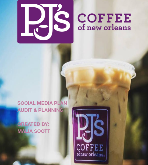
SOCIAL MEDIA PLAN FOR A BUSSINESS PROJECT
Social Media in Strategic Communication - Spring 2023
|
This is a project I did in a class I took called Social Media in Strategic Communication where in this class we examine the uses and power of social media in relation communication. We learn how to best utilize social media platforms to spread a message or promote a brand.
So, by taking everything we learn from the course we had to create a social media plan for a business or organization. For my project I did PJ's Coffee. They are local business across some states where they sell the best coffee. The company itself are doing well, however, with this social media plan I created could help the local companies be even better on their social media platforms. Within this audit I analyze how the company is doing on social media so far such as what kind of posts and pictures they post, they type of audience, posts that receive the most likes, etc on their social media's. I even did an audit where I analyze a competitor brand called Midnight Oil Coffeehouse of PJ's Coffee. They are a good local coffee as well as doing well on their social media platforms. I also included secondary research about coffee shops. I discuss PJ's action planning such as objective, their social media strategy, customer interviews, and buyer personas. I even included a social media calendrer for PJ's that contains social media content they can do post as well as provided three posts of photos related to PJ's they can post. For the last part of this project is the evaluation where I discuss how the company will measure their objective, and how their campaign will evaluated such as reach, views, likes, engagement, etc. Overall, I wanted to include this project in my portfolio because I feel like it show case my research and design document skills within this project. A lot of research went in this project as well as setting up the documentation to make it look professional and well detailed. |
| ||
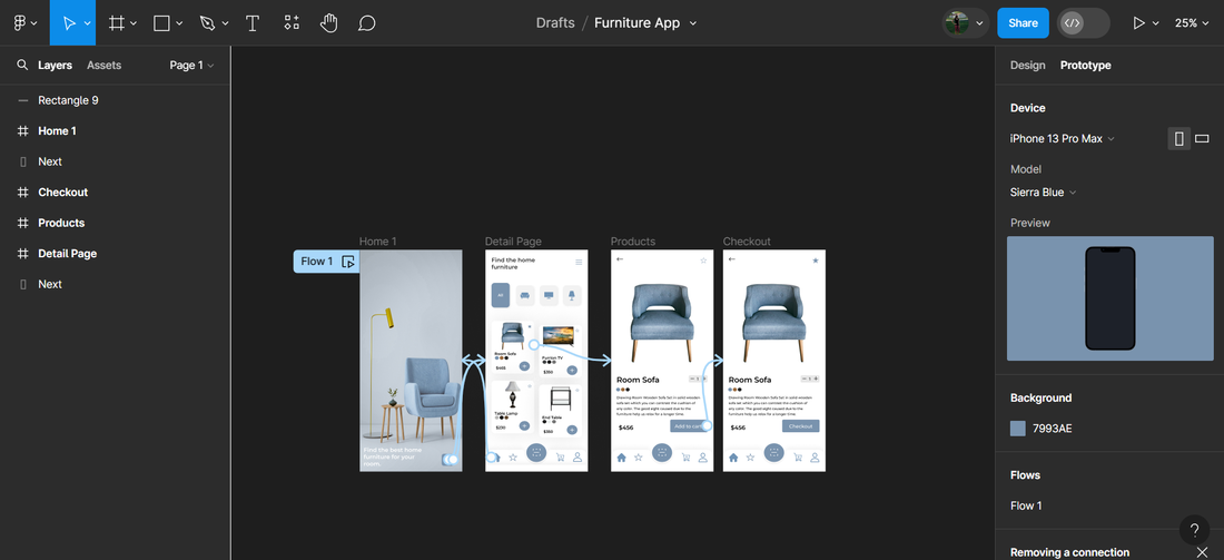
Furniture Mobile App - Spring 2024This is a furniture app I did on Figma. I followed along a tutorial video on how to a make app in Figma where I follow along how to make this app. I never made a app in Figma. I have made a app in Adobe XD. I really want to learn more about UI/UX as I know UI/UX is important in design. Designing a mobile app is very interesting to me but brings so much creativity which I like. There's a lot of benefits of designing mobile apps. I really enjoy the process such as the design, wireframing, and prototyping, etc. I can see myself making more apps to build up my UI/UX skills.
|
| ||
